

Craie is a chalk-like off-white; Nata is creamier and gently warm. Their subtle differences are easiest to explore on the same leather, with comparable photographs of the actual pieces.
Discuss my colour shortlist ↗- Craie
- Code 10 · chalk-like off-white
- Nata
- Code I2 · creamy off-white
- Shared published material
- Epsom
- Comparison limit
- Separate photographs, not calibrated colour standards
Photographic leather samples

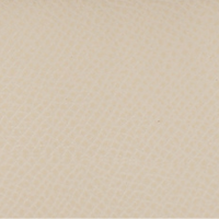
Photographed under different conditions. Lighting and screens affect colour; the grain is not shown at a common physical scale.
What is the difference between Craie and Nata?
Craie and Nata are separate Hermès colours, not alternative spellings of the same white. Craie is recorded as code 10; Nata as I2, beginning with a capital letter I.
The useful starting distinction is chalk-like off-white versus cream. Nata has a gently warm, ivory-like character. Craie’s subtle undertones are described differently across photographs, so a universal claim that it is always cool or always warm would overstate the evidence.
| Reference | Craie | Nata |
|---|---|---|
| Confirmed code | 10 | I2 — letter I, then 2 |
| Starting colour description | Chalk-like off-white | Creamy, gently warm off-white |
| Shared swatch shown here | Epsom | Epsom |
| Other samples on the profile | Togo and Country | Swift and Clemence |
Compare Craie Epsom with Nata Epsom
Epsom is the shared leather in the published samples for these two colours. Starting with the same material helps you consider the colour without also switching between a smooth surface and a strongly grained one.
The images are separate reference photographs, not a controlled colour test. Different exposure, background and white balance can exaggerate or reduce the cream impression. Do not use their relative brightness as a measurement of the two colours.
The displayed texture is also not at a common physical scale. Use the swatches to choose what to explore, then ask for current photographs of the actual candidate bags in similar light.
Why two pale colours can look identical online
A bright exposure can wash out subtle differences in an off-white leather. Warm indoor light may make both look creamier, while the camera’s colour processing can move the result in the opposite direction.
A neutral background and diffuse daylight are useful conditions to request. Include a full view and a close-up, and avoid judging from a screenshot that has been copied through several messaging apps. Even a well-made photograph remains a reference rather than a calibrated colour standard.
Choosing between chalk-like and creamy
Try Nata if the soft cream impression is what attracts you; put Craie beside it if you prefer a chalk-like off-white. Compare both with the whites and creams you already wear, because a bag can appear different beside a bright white shirt and a warm ivory knit.
Then consider hardware and the complete bag. A pale swatch fills very little of the screen; a larger bag introduces more of that colour into an outfit. The model, size and finish deserve the same attention as the difference between the two colour names.
Keep condition separate from the shade
Ask for close-ups of the handles, corners, back, base and edge paint, plus any cleaning, recolouring or restoration history. A warm-looking photograph does not by itself prove that a pale bag has darkened, and an overexposed photograph can hide marks.
In your sourcing request, state whether you want only Craie, only Nata or would consider both. Add model, size, leather, hardware, condition, budget and destination. We can then discuss options against a clear brief, rather than treating similar online photographs as interchangeable.
Frequently asked questions
Are Craie and Nata the same Hermès colour?
No. Craie is code 10; Nata is code I2. They are separate pale neutrals in this reference.
Which is creamier, Craie or Nata?
Nata is the creamier, gently warm off-white in this comparison. Craie is described as chalk-like. Lighting can make the distinction difficult to see, so confirm it on the actual piece.
Is Craie always cooler than Nata?
We do not use an absolute rule for Craie’s undertone. Its photographs and descriptions vary. The same-leather samples help frame the comparison without pretending to remove lighting differences.
Why does this comparison use Epsom?
Epsom is the common material in the samples in this guide for both colours. It provides a more focused starting point than comparing different colours on different surfaces.
Can The French Hunter help me find either colour?
Yes. Send your model, size, material, hardware, condition and budget, and tell us whether both colours are acceptable. The samples are references, so the available options still need to be assessed for your exact request.